Max:
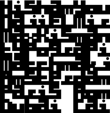
I created a set of capitals and lowercase. A few characters are similar. Some need more work. Some connections fail, but maybe that isn't too bad after all. Thinking back of our basic setup in Arabic and Latin, the variation works pretty good. I think that the white and black balance is close to what we were looking for. In the last example without the white separation lines, it gets its own visual rhythm.
Naji:
I am loving it! this is becoming so interesting, especially the last 2 boards with the mix of upper and lower cases. I really like what we are doing cause we are taking typographic matchmaking a step forward like none have done it before; Latin is taking some aspects from Arabic and vise versa. I need to start designing the rest of the Arabic alphabet.
Let's keep the tempo...


