Working for nine years in the Arab region
I moved between a number of jobs, companies and countries. My first job was in cartoon animation during my BA study in Damascus. That was with StarAnimation Company between 2003 and 2006. After my graduation, I moved to Dubai to work for a short period in the same field with BlinkStudios. After that, I started my career in graphic design when I moved to Riyadh to work with Oak Advertising, where I worked for around 3 years. This was the beginning of my developing an interest in type design. Then I moved to Qatar where I joined Fitch, an international agency specialised in branding. I believe that working on logotypes and dealing with Arabic texts for a considerable part of my design career was the main reason behind my increasing appreciation of type. It was during my work at Fitch that I considered applying for a type design program.
KABK or Reading?
When I decided to apply for a course in type design, I had no clue about the best programmes or universities that offered it. The one point I was sure about is that the course has to be in English so that I don't have to learn another language. I recall starting my search on Google. I opened around 70 pages from which I started to filter out the less favoured courses or irrelevant links. I ended up with only two links: the MATD course at the University Reading and the Type and Media course at the KABK (Royal Academy of Art in the Hague). Now I look back and I think that it was indeed a good search for someone who had no clue! I applied to both programmes of course. I recall that KABK responded by explaining that I was shortlisted but not accepted due to the high number of competitive applications (I hope this was true and that they were not just trying to make me feel a bit better!). On the other hand, Gerry Leonidas personally got in touch with me and asked me to send more work, sketches or drawings related to type. He also asked me questions related to type and to my interest in studying it. After a few emails, he replied saying something like: "OK. I'm convinced now" and that he would recommend my application to the University. I was of course super excited and I think that this considerate handling of my application was indeed the start of everything for me.

My current working situation
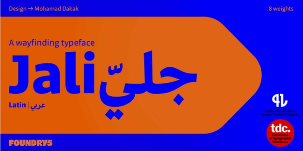
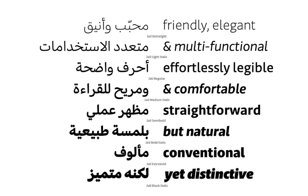
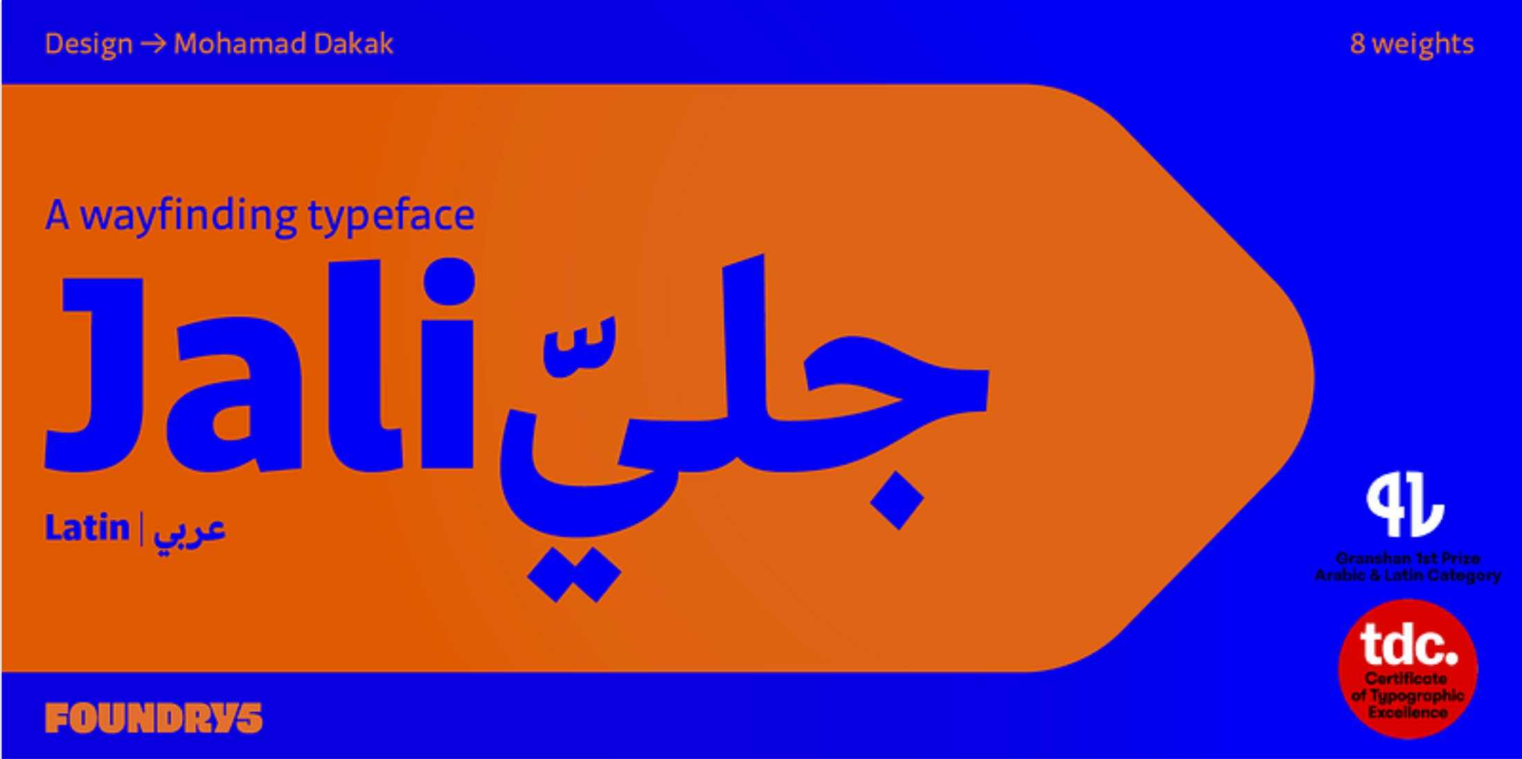
I'm currently a PhD student at the Department of Typography and Graphic Communication at Reading, an independent type designer, and recently a co-founder at Foundry5. My main focus at the present is on finishing my PhD as I'm a few months away from my prospective date of submission. During the last four years, I was involved in a number of type design projects both as a designer and as a consultant. I also invested a lot of time in developing my typeface Jali which was recently released. I worked on this font from scratch until the last stage but I asked advise from an external on the production of the files before the typeface was released. With my typeface Jali, for example, I was very lucky to have my colleagues Kostas Bartsokas and Pria Ravichandran look at the production and quality standards of the font files. This lead me to briefly introduce the type foundry which I'm thrilled to be part of and where Jali is released. Foundry5 gathers talents with wide-ranging script expertise including Latin, Arabic, Indic, Cyrillic and Greek. We've been working on establishing the foundry for almost a year. Things moved slower than we wished during 2020 but now the foundry is officially launched. Next, I worked on a couple of projects with Google which has been a great opportunity, especially that the projects will be free for public use. There is a third project of a similar nature that I'm currently working on but it is still early to give details about it. I was also lucky to work with Dalton Maag as a consultant on a number of Arabic typefaces. It was a great pleasure for me to work with such a professional, talented and friendly team.
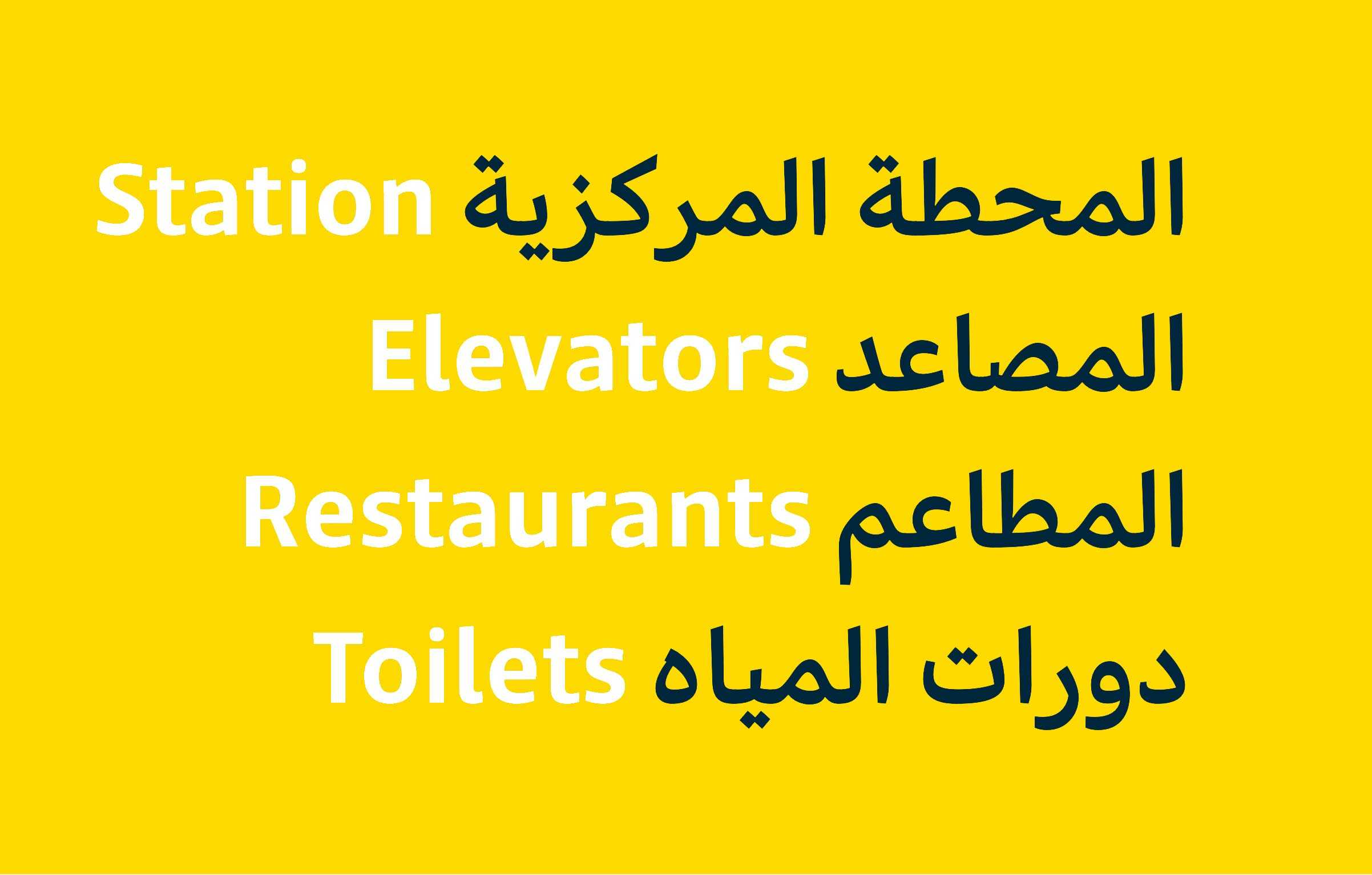
A big gap
I think there is a big gap in modern functional Arabic typefaces and this is the area that I intend to focus on, at least for a few more future projects. I think it is strange that the common trends in Arabic type design aim at extremely high levels of novelty while there is a significant shortage in Arabic typefaces that are actually suitable for text. Take a look at printed Arabic books or newspapers for example and you will easily notice the very limited number of typefaces in use. This, in my opinion, is partially because there are not many good alternatives. The majority of modern Arabic typefaces can only function as display typefaces because they considerably deviate from conventional forms. This is why I think it is important to contribute to filling this gap.
A bit of Arab type design history
Arabic type design as a profession went through very interesting stages. The contexts of the previous century brought what I like to call a "delocalisation" of the industry of Arabic type-making. This was mainly a result of introducing industrially-complex yet very effective western typesetting machines within the industrially-inferior Arab region. During this period, major developments in Arabic type were made or decided on by western manufacturers of typesetting machines while local contributions to the industry were rather marginal. In other words, the profession of Arabic type design within the Arab region became almost extinct during this period. It was only with the introduction of digital software applications for designing Arabic at the turn of the twenty-first century that local contributions to Arabic type design could be revived. Within this context, it is justifiable that early local attempts were not necessarily well informed, especially after a long gap in local expertise or education in the field. However, probably for the same reasons, some of the low-quality typefaces were able to gain considerable popularity. I recall that by early 2010s, I was myself a fan of some typefaces which I would not bear looking at in these days! This was the case with many other graphic designers who were simply excited about seeing something new. Luckily, this situation started to change during the last ten years. An increasing number of international and local programmes are being involved in teaching Arabic type and typography. Research, conferences and discussions about Arabic type are developing and getting more mature. An increasing number of educated and skilful Arabic type designers are contributing to the field. Moreover, international foundries are becoming increasingly interested in providing high quality Arabic typefaces for the Arab markets. So, in summary, although the industry of Arabic type design has gone through challenging stages, the last 10 years brought significant developments and I'm optimistic that this will increase in the coming few years.
Any design heros?
I think "heroes" is a big word which I would only give to my type design teachers. I would name Gerry Leonidas, Fiona Ross and Gerard Unger whom I'm most grateful to. I consider them my heroes not only for the expertise they shared with us but also for their humbleness, character and extreme support. There are, of course, many other names in the field who I highly appreciate. Research-wise, I think Titus Nemeth–who is also a very talented type designer–produced one of the most important books about the modern history of Arabic type. I admire the type design works of Kristyan Sarkis and I consider him as one of the most remarkable Arabic type designers at the present. I also highly appreciate the work of Thomas Milo and Mirjam Somers at Decotype, especially their completely out-of-the-box technical approach to rendering Arabic type. The list can go on!
Except for Kristyan only Western heros, most from Reading?
Maybe I should first clarify that in my previous answer I did not intend to provide a comprehensive list but I rather briefly mentioned some works which I personally find remarkably valuable. If I shall expand the list of talented contributors to Arabic type, I would mention many names from the Arab world and Iran including but not limited to Kamal Mansour, Pascal Zoghbi, Borna Izadpanah, Bahman Eslami, Azza Alameddine, Sahar Afshar, Khaled Hosny, Mohammed Abdelhadi and more. I would also add more names from the Western world such as Tim Holloway, John Hudson and Patrick Giasson among many others. But I should also explain that I really don't look at designers/experts as "westerners" or "locals" but I rather believe that a successful designer of any script can be from anywhere as long he/she has the right knowledge, skills and experience.
In regard to your comment about the influence of the West on the development of Arabic type, I agree that this, to some extent, is still ongoing but probably not as direct or exclusive as the case used to be during the twentieth century. But also, to be frank, I don't think that there is an issue with the ongoing influence of the West but rather in the ongoing lack of adequate contributions from the local regions. For example, western universities which offer higher degrees in type design and research (including Arabic type) still have no equivalents in the Arab region. Moreover, the Arab region is still incapable of making its own machines, software or technologies. This contributes to the fact that the current global type design and rendering technologies are still tied to standards which were initially designed to fit the needs and nature of the Latin script. These standards which are not ideal for the needs of the Arabic script still pre-determine the visual representation of Arabic type until the present day. So, when considering both the academic and industrial inferiority of the Arab region, I think it is no wonder that the Western influence is still ongoing.
A final comment that I would like to add is that my mention for the contributions of Titus Nemeth and Decotype was not necessarily for their influence on Arabic type but rather for their value. For example, although Decotype proposes a technical approach for designing and rendering Arabic that is uniquely innovative and painstakingly mindful of the needs of the Arabic script, the fact that it is not supported by common type rendering technologies makes its use (and hence also its influence) very limited. Similarly, the research of Titus Nemeth might only be examined by serious researchers (or probably some extremely nerdy designers) despite the fact that it covers a very important historical period of Arabic type design. However, the limited influence of such contributions does not bring down their value in my opinion.
Dr. E. Plooij was the innovator, Decotype spend a lifetime on the adaptation of his invention. Ultimately, the (Decotype) Tasmeen font collection is bizarre at best. Hardly a source of inspiration.
I think it would be useful to break down this question into parts because you're presenting some completely valid points but also probably sometimes mixing it with unfair judgements. For example, you've validly pointed out some shortcomings of Tasmeem when you described its fonts collection. That, however, can be related to curation/planning/design skill issues. Another aspect to consider is the fact that the design software is not available for the public which means that the experimentation with the tool is restricted to a few users and therefore it is not allowed to show its full potential. I can add to this the challenge that Tasmeem typefaces are only functional on specific softwares with the required plugins, which makes the appetite to use it or design for it much less. While these shortcomings surely negatively affect the success or spread of the project, they, in my opinion, do not devalue the genuinity of the technical approach which I mentioned earlier in our discussion. What I specifically admired in my previous comment (I hope you still remember it after taking ages to reply to you!) was the technical approach which deals with the Arabic script based on its needs rather than on what is already available/approachable to us as a technology.
Plooij's case also had a similar but more extreme situation. His endeavour basically couldn't "get the visa" to go out to the world because major manufacturers of typesetting technologies were not enthusiastic about it. This means that the project was buried before it was even born. So, in summary, I think it is very important to differentiate between the technology/vision/mentality and the commercial success which might be affected by many factors.
Back to the Arab Roots?
I agree with what you suggest and I see this as a natural response to the extraordinary challenges that Arabic type have faced throughout the last century and still faces today. For example, Arabic type still carries the influence of extreme technical limitations of previous typesetting technologies. This can be seen in some widely used Arabic typefaces today which show considerable levels of simplification (or even distortion) of the original representation of Arabic. The approach of these typefaces initially emerged as an adaptation to the limited number of sorts which some hot-metal typesetting machines were designed to handle. Although such limitations are not anymore relevant in digital technologies (at least in principle), the legacy of their influences is still carried on. This technical influence is only one side of the crisis. Another side can be seen in the noticeable spread of "Latinised" Arabic typefaces, a trend which is probably more obvious in the Arab region compared to regions such as Iran or Central Asia. This approach which imports the grid, modulation and even lettershapes from the Latin script is often proposed as a "modern" approach to designing Arabic. In my opinion, this proposal can be strongly linked to the global influence of "Westernisation" where attraction towards the western civilisation led to importing many cultural aspects into local societies, not excluding the appearance of its script in our case. Although Latinised Arabic typefaces have recently caught a trend among designers, I think that the superficiality of their approach is very obvious. For example, what if the Chinese script becomes dominant in a few decades? Would we have to switch to designing Arabic letters in squares?!
So, considering the challenges briefly demonstrated above, it is no surprise that educated Arabic type designers realise the need to provide better solutions for Arabic type. Overtaking the previous challenges might not be easy because building mass awareness or changing compromised practices which already became established is not easy. However, I find it promising to see an increasing number of designers who are contributing to such a change and I think it is just a matter of time until Arabic type starts regaining a better position. This is also surely supported by the rich and beautiful history of the Arabic script which can form a great basis for genuinely modern typographic interpretations.
I think that growing up being familiar with a script can be a privilege for a type designer but is also not necessarily so. For example, in many works which are produced by local Arabic type designers, you can find an extreme influence by the Latin script, poor craftsmanship or even sometimes mis-implementation of orthography. On the other side, there are remarkable Arabic typefaces which are well-informed, professionally produced and finely crafted produced by type designers from the West. Of course, this is not a generalisation of the situation but only a demonstration that there are many factors which can affect the quality or the personality of a designer's work.